
Clear content for better products
Hi, I’m Tara, a content designer and UX writer in the NYC area.
I design systems and strategies that help people navigate products with confidence.
Let’s work together.
Recent work
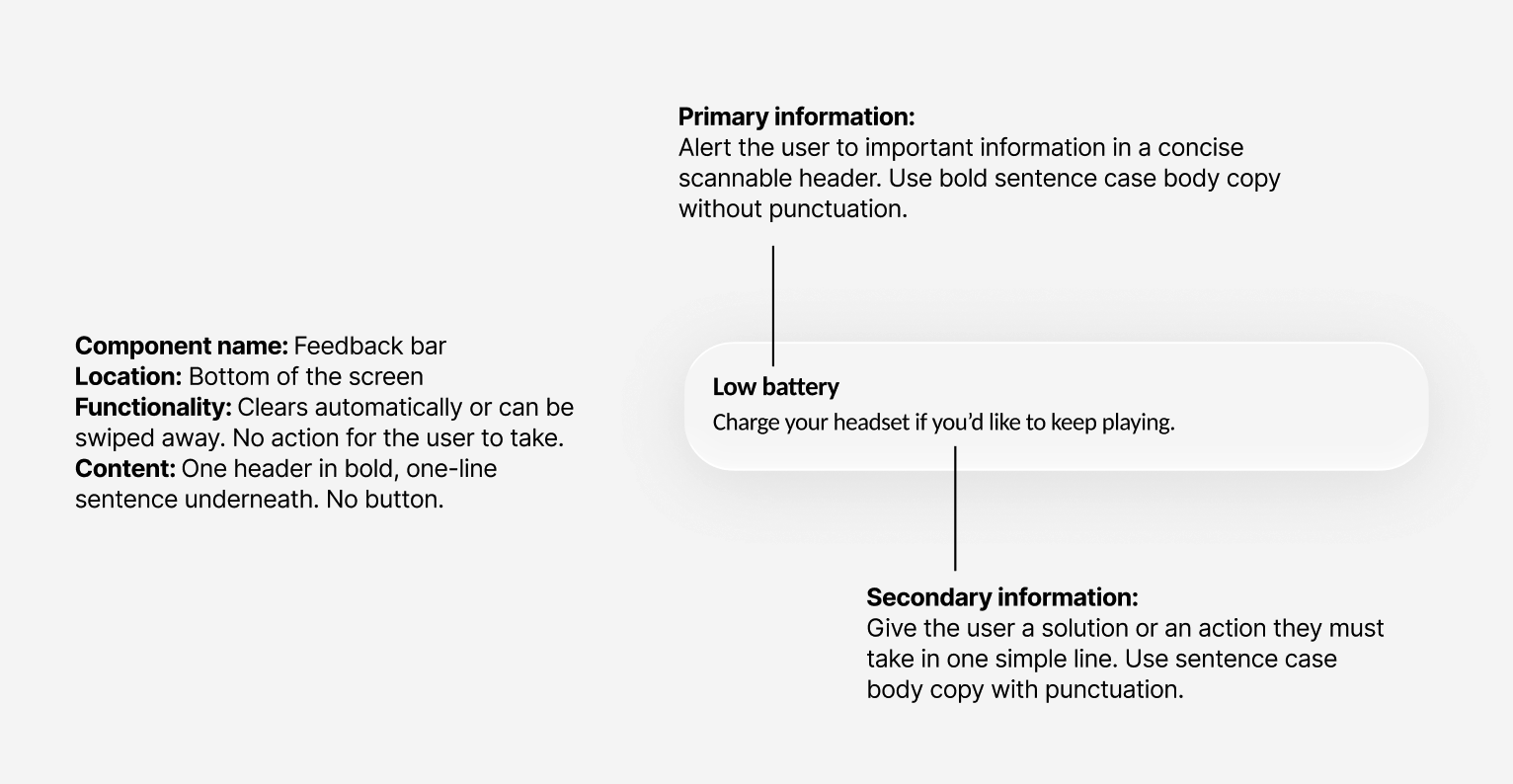
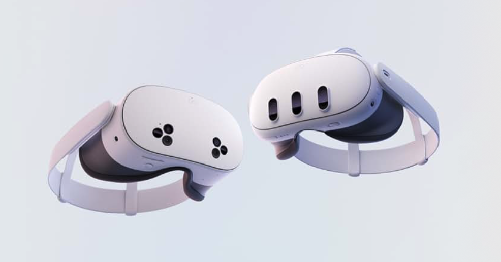
Notification Information Architecture
A scalable framework for temporary communications.
Overview
Gamers using the Meta Quest VR headset received way too many disruptive notifications and popups (cognitive overload in an already busy immersive setting)
The Meta Quest VR headset lacked clear, documented content guidance for temporary messages like notifications, tutorials, tool tips, and toasts
Most temporary messages were called “toasts” regardless of the component used and the type of message it held
There were too many variations of components
How can we…
Create a clear, descriptive nomenclature for components that everyone understands
Craft guidelines for how to structure content within the components
Align on where these messages appear
Refine the prioritization of temporary messages
Involve project stakeholders and previous designers to ensure all voices are heard, all previous work is accounted for, and everyone is aligned. (Tall order, I know.)
Content design solutions
Name components based on the content within, e.g. educational components are “tutorials” and components that give feedback are “feedback bars”
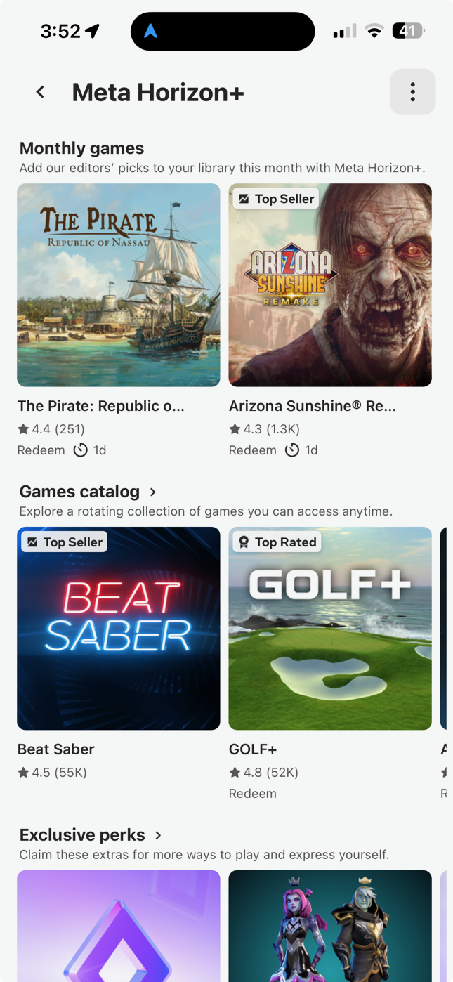
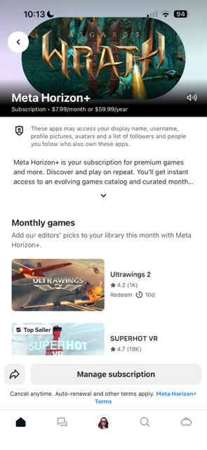
Meta Horizon+
Meta’s first subscription service for VR gamers.
Overview
Users wanted access to more games and Meta wanted more active gamers.
How can we…
Keep users coming back month to month
Boost total purchase volume
Give the people what they want (more games!)
Content design solutions
Name this first-to-market product and define its value props
Explain what it offers during onboarding, in product detail pages, storefront ads, and go-to-market emails
Make it easy and intuitive to subscribe and manage
Results
$150,000 positive TPV over 5 months post launch
180,000 subscribers over the first 5 months
106,000 email conversions
1M active subscribers and over 100 games as of February 2026
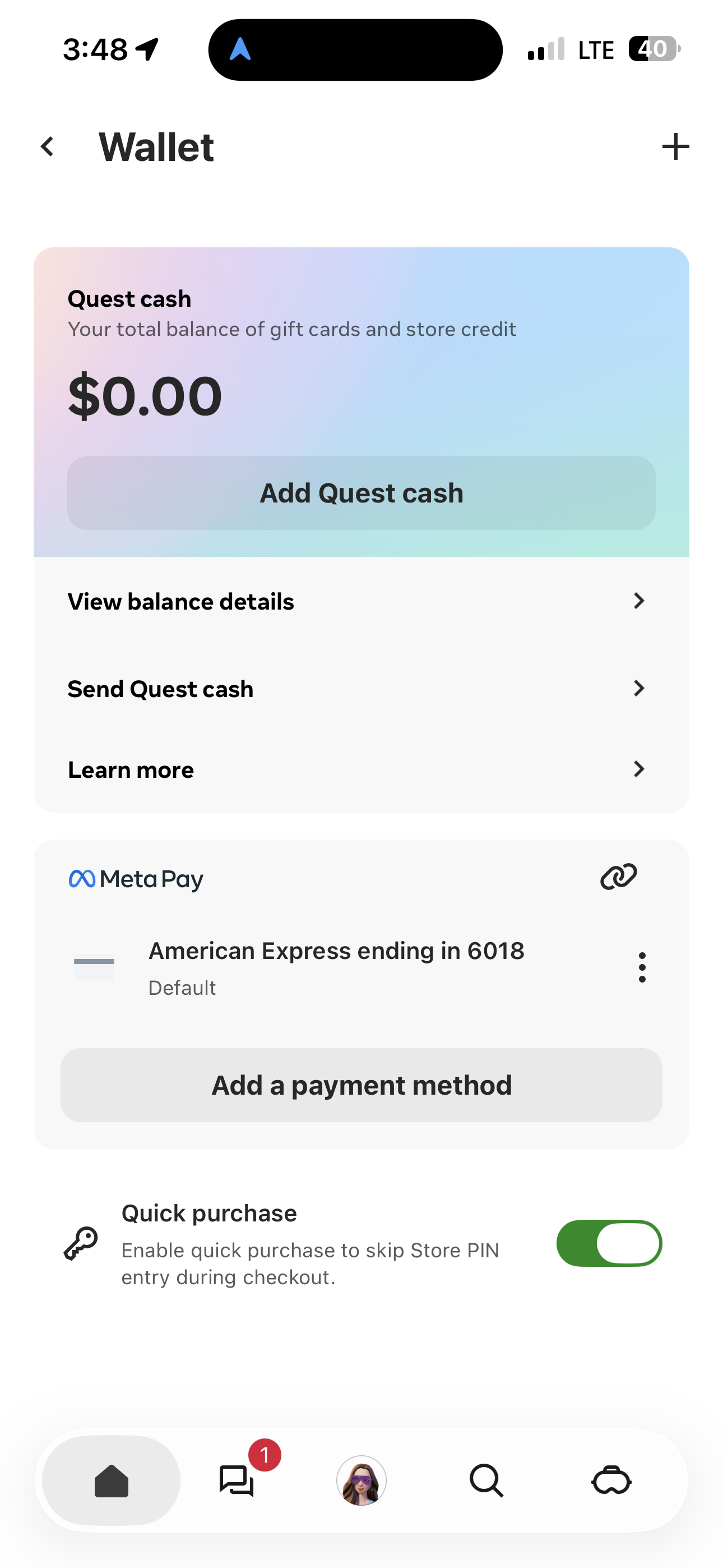
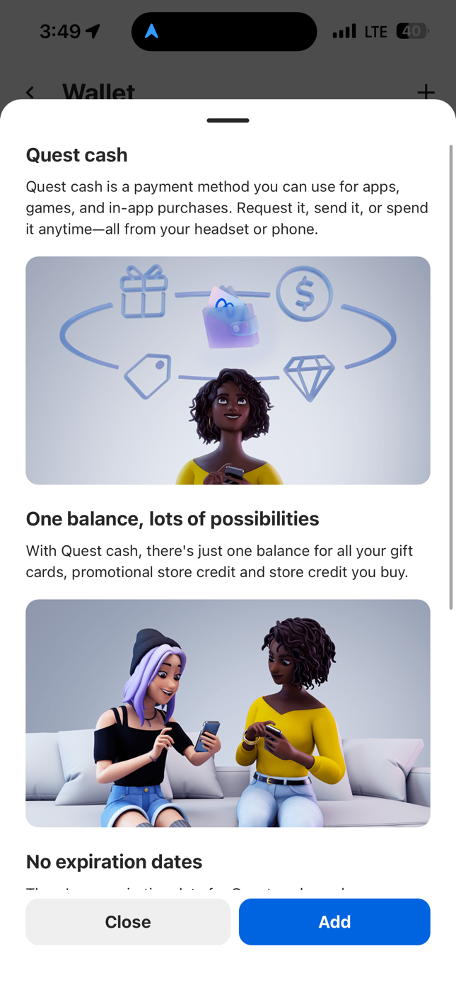
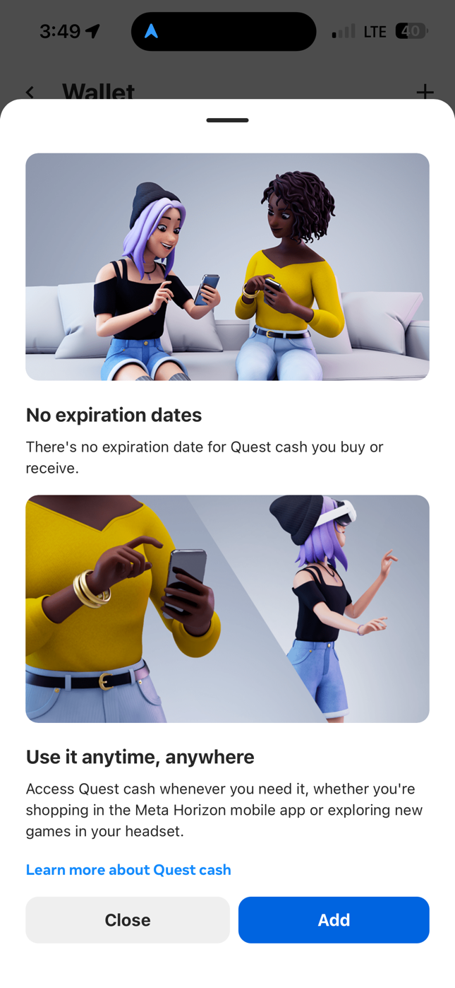
Quest Cash
A digital currency for parents and their kids.
Overview
Users wanted an easy way to send friends and family money to spend in the Meta Horizon Store.
How can we…
Educate users on this new feature
Boost TPV with more ways to spend
Design for both kids and adults
Content design solutions
Name this product and define its value props
Create a way to learn more about it
Make it intuitive for (almost) all ages to use
Protect youth from safety risks with built-in parental controls
Results
Quest cash earned over $1M in 6 weeks
Our most vulnerable users were protected from serious safety risks
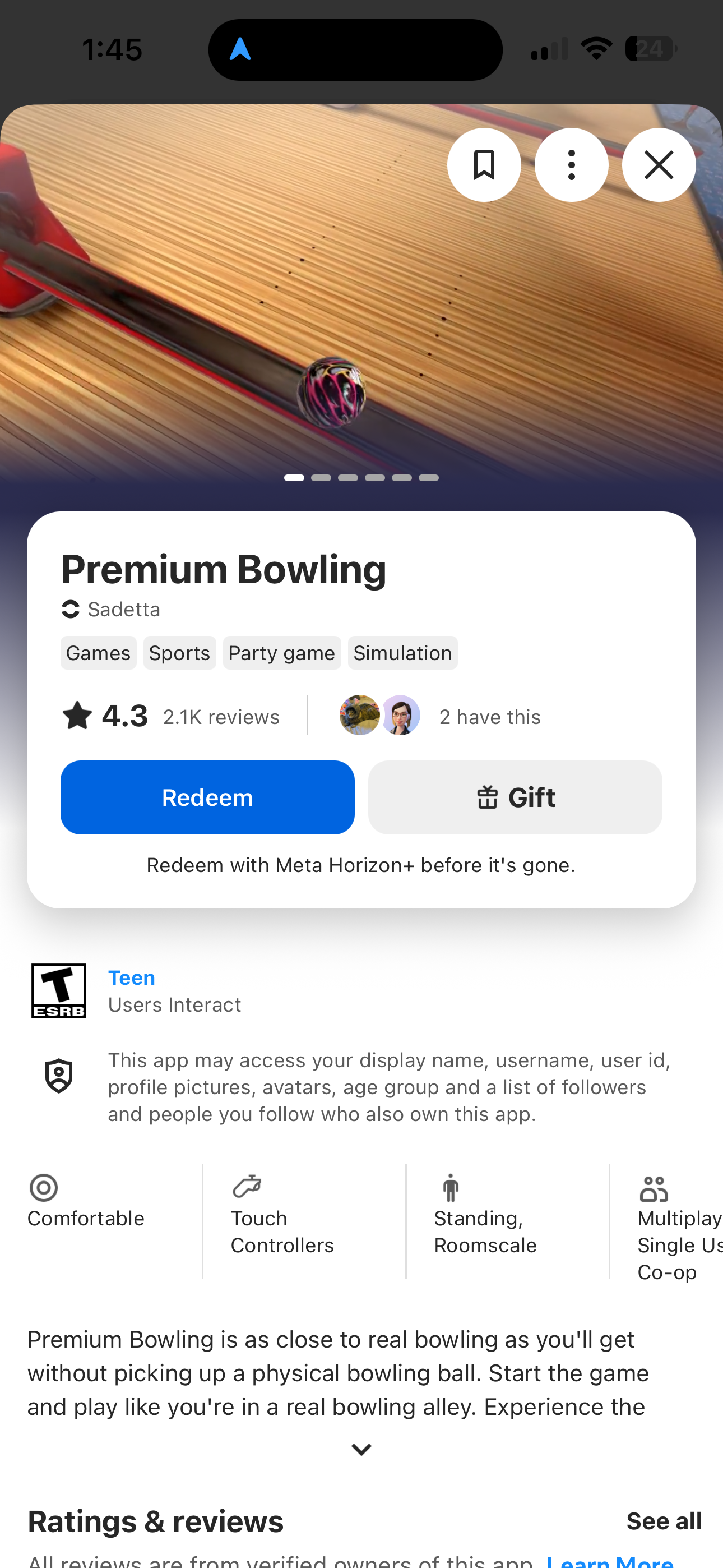
Meta Horizon Store UX
A human-centered approach to shopping for games.
Overview
The Meta Horizon VR app store was hard to shop. It frustrated users and hurt store’s total purchase volume.
People couldn’t find what they were looking for
Apps shown were not relevant to users
Excessive padding and too much metadata pushed important content out of view
Difficult wayfinding left users unsure of how to purchase
Content design solutions
Organize and label apps in more relevant ways, like “Free” or “Top selling”
Develop metadata guidelines (based on user research) reducing key info to three scannable lines
Drive cross-functional alignment on taxonomy terms (e.g. genre, category, popular) across metadata and badges
Create content principles and a flexible content hierarchy for product detail pages
How can we…
Surface relevant content in meaningful ways
Reduce visual clutter and redundancy
Showcase a breadth of content without overwhelming people

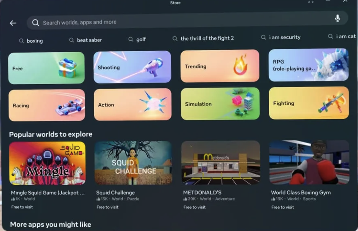
Store landing page in mobile, with category cards, easy access to free games, personalized shelves, and reduced metadata.
An app PDP with a buy box featuring all the info users need to make a confident choice.Results
Store content became easier to scan and shop
Users had all the info they needed to buy confidently
Today, over 100 apps have crossed $1M in revenue
The new Store landing page features category cards (including an evergreen entry point to free games), reduced metadata, and a nod to Store's breadth of content in the search bar.Spatial Trust and Privacy Experiences
Building trust and safety in emerging tech.
As Meta’s content design lead for VR Privacy Experiences, I partnered with stakeholders in policy, legal and engineering to simplify complex privacy consents so they could be understood by users of all ages.
I also helped shape Meta’s VR privacy commitments to build user trust, working closely with Meta’s central privacy org to ensure we upheld the company’s policies in spatial experiences.
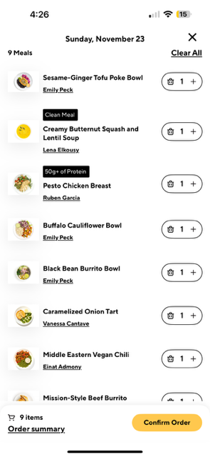
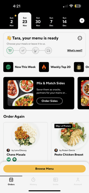
CookUnity app redesign
An intuitive framework designed to evolve and grow.
Overview
The app lacked a cohesive brand voice
Checkout was an endless vertical scroll
Users were overwhelmed by the number of choices
It was difficult to skip or cancel deliveries
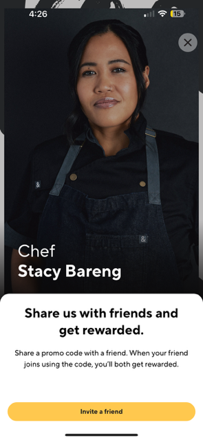
Chefs felt underrepresented and wanted to better showcase their talent
How can we…
Show users a quick status of present and future orders
Give users access to upcoming menus
Showcase more meals and chefs
Make it easier to cancel or skip orders
Personalize the experience
Teach users about these new features
Content design solutions
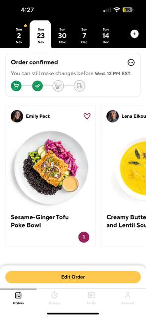
Give users timely updates in a tabbed design
Surface personalized metadata to build confidence
Establish clear nomenclature for buttons and nav
Give more visibility to chefs throughout the experience
Build educational coach marks into our roadmap
Results
We saw a steady decline in skipped orders as our new menu was easier to explore and more relevant to customers
The app has successfully scaled to support 180+ award-winning chefs and 300+ meals every week
I led content design for this new, exciting experience, from brainstorming meal collections to crafting guidance on UI.
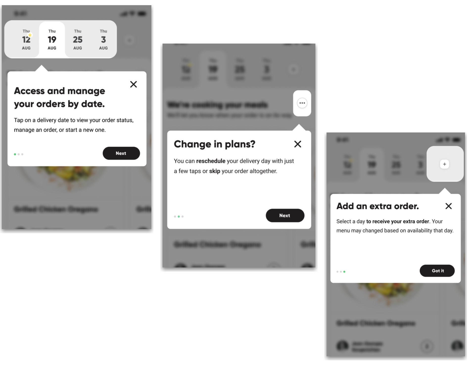
Coach marks guide users through the experience the first time they see it.
Marriott Bonvoy app launch
An elevated experience for a new era of Marriott.
Overview
Marriott acquired Starwood Hotels, along with its Starwood Preferred Guest loyalty program
Marriott needed merge two loyalty programs into a single app
Guests worried they would lose their benefits or points
How can we…
Give users at-a-glance access to points and perks
Infuse a new Bonvoy brand voice into all user touchpoints
Make this merger as painless as possible for SPG loyalists
Content design solutions
Leverage familiar brand language to orient SPG users
Define the continent hierarchy for a new points dashboard
Establish global guidance for language in the UI
Personalize the experience with relevant a content tailored to each user
Results
4.9-star rating in Apple’s app store
248 million Bonvoy members today
Starwood Preferred Guests barely remember life before Bonvoy
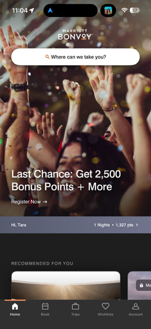
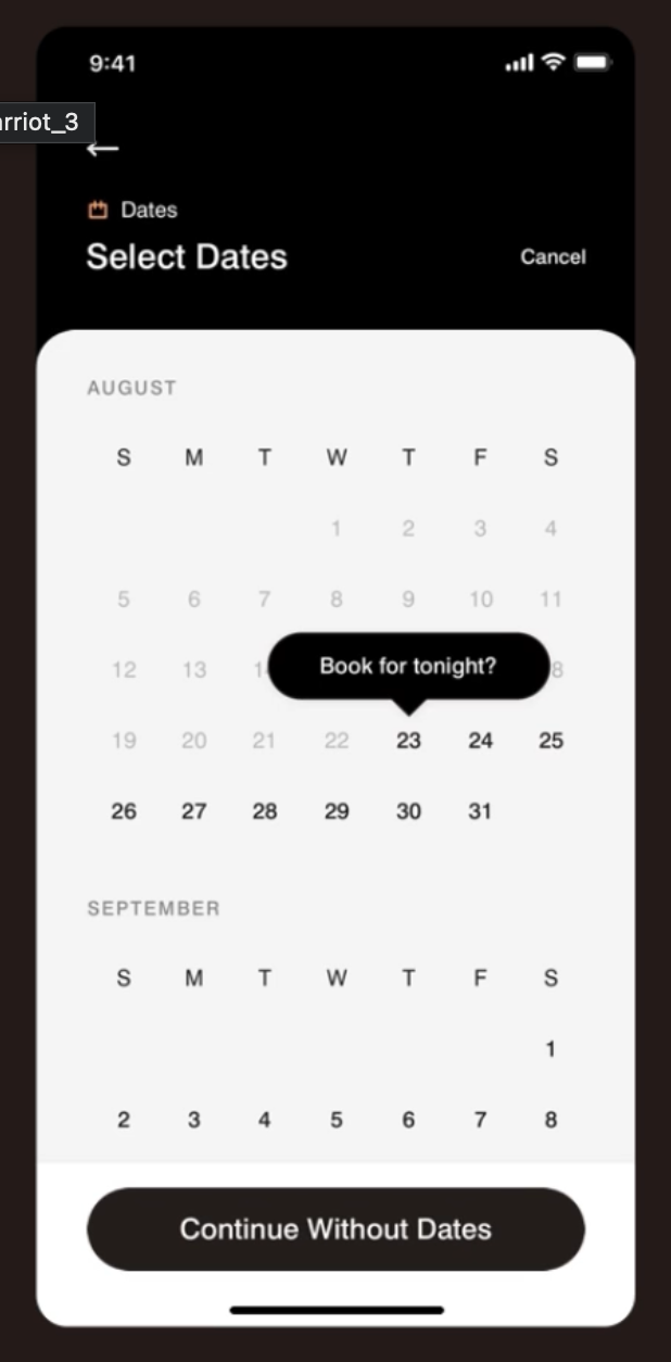
At-a-glance info, intuitive UI, and progressive disclosure for browsing and planning.
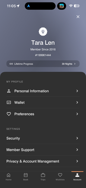
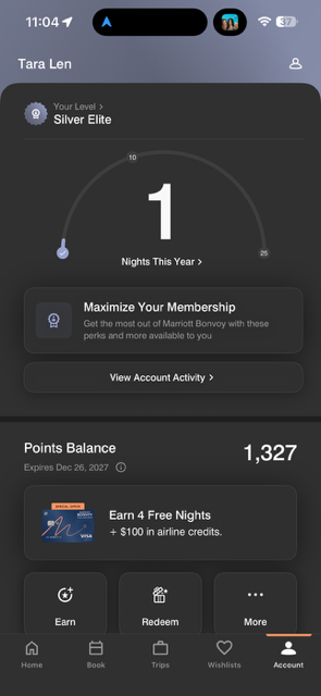
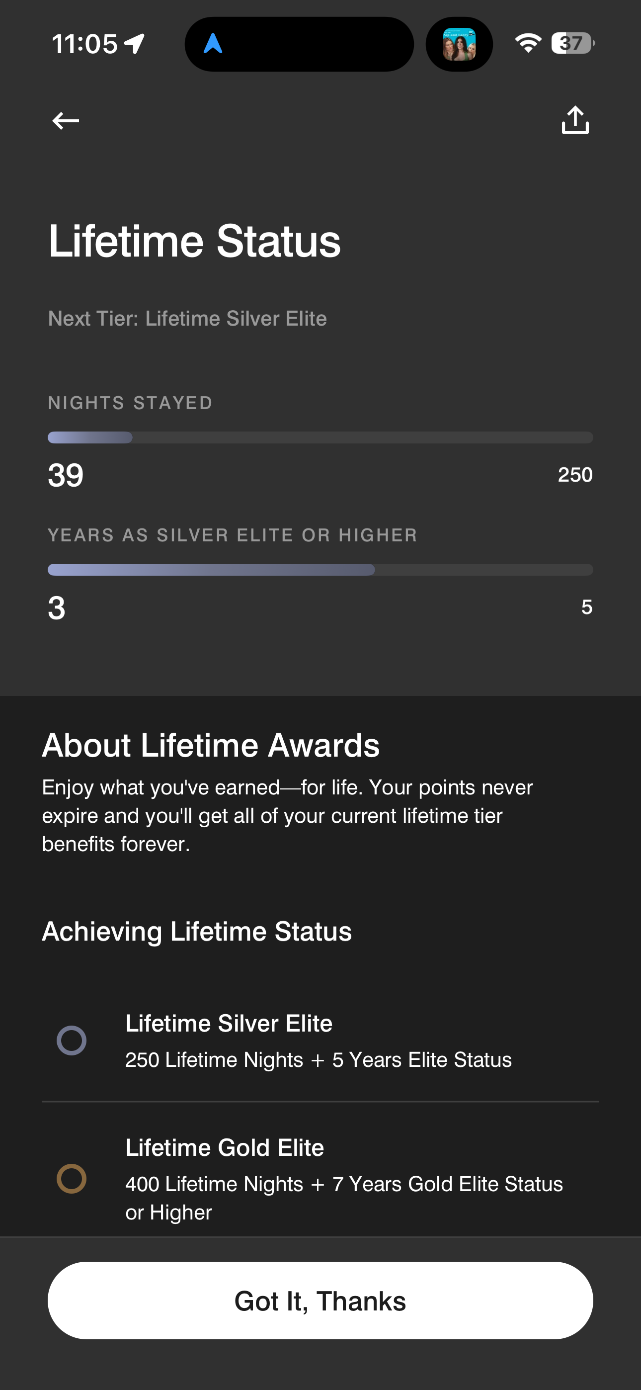
Consistent language and a flexible UI for a tiered membership program dashboard.